When AI Made Me Slow Down
AI · Internal Tool · Design Team
AI · Internal Tool · Design Team
When AI Made Me Slow Down
How building a tool to speed up my design process ended up forcing me to do the work I was skipping. And why that changed everything.
Role
Senior Product Designer
Project Type
Internal Tool · Design Team
Tools
Claude AI, Figma, custom workflow
The Problem
AI made it too easy to skip the work that actually matters.
When AI tools became part of my workflow, my process quietly fell apart. Not all at once. Just the beginning parts. Instead of starting with research or writing a proper problem statement, I'd open a prompt and start describing what I wanted to build. Claude would give me something back in seconds. It felt productive.
Why spend time mapping a user flow when you can just describe the interaction and get a response? Why document pain points when you can jump straight to exploring solutions? The AI made those early steps feel optional, because the output kept coming regardless.
The work looked fine on the surface. Layouts, copy, wireframe directions, all generated fast. But none of it was grounded in anything. I hadn't defined the real problem. I didn't have a clear picture of the user. I was producing output without doing the thinking that should come before it.
The Honest Diagnosis
“I was designing fast. I wasn't designing well. There's a difference.”
The speed wasn't the problem. The problem was that the speed gave me permission to skip steps I should have been taking. The user had disappeared from the process entirely, and I hadn't noticed.
The Insight
What if the tool itself refused to let me cut corners?
The issue wasn't that I lacked knowledge. I knew exactly what good process looked like. The issue was friction: doing the upfront work felt slow, especially when I was confident I already knew the answer.
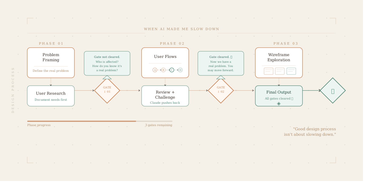
So I built something designed to create friction in the right places. The Design Process & Prototyping project is an AI-powered workflow tool that walks through every phase of a design project, but it won't let you advance until you've actually done the thinking. It's structured around gates.
How It Works
A gated process that earns its way forward.
Phase 01
Problem framing
Define the real problem, not just the symptom. Who is affected and why does it matter?
Gate ↓
User research
Document actual user needs and pain points before any solution thinking begins.
Phase 02
User flows
Map the journey your user takes: every decision point, every moment of friction.
Gate ↓
Review & challenge
Claude pushes back. Gaps get surfaced. Assumptions get named.
Phase 03
Wireframe exploration
Multiple directions, not just the first idea. Structure before style.
Gate ↓
Final output
Only when all gates are cleared does the real design work begin.
The gates aren't arbitrary checkboxes. They're built around the questions a good design critic would ask: the kind of questions a senior peer or a product manager would raise in a review. If your answer is thin, the tool won't let you move on. You have to actually think it through.
The Claude Factor
An AI that argues back.
The most important design decision in this project wasn't visual, it was behavioral. Claude doesn't just receive your answers and nod along. It actively looks for holes. Here's what that looks like in practice:
Example: Problem Framing Gate
Users are frustrated with the onboarding flow. I want to redesign it to be simpler and faster.
That's a direction, not a problem statement. A few things I'd want to understand before we move forward: What specific part of onboarding causes frustration: is it the length, the information being asked for, or something else? How do you know it's frustration and not confusion? And who exactly is “users” here: new signups, returning users who got logged out, or someone else? The solution looks very different depending on those answers.
Fair. The frustration is primarily from new users who drop off during account setup, specifically the step where we ask for company size and role. Research shows they don't understand why we're asking.
That's much more specific. Now we have a real problem: users are abandoning a required field because the value exchange isn't clear. They don't know why you need it or what they get in return. That's a communication problem as much as a design one. You can move to the next phase.
This kind of friction is exactly what's missing when I design alone. When I'm in flow, I skip past the questions I can't immediately answer. This forces me to stop, sit with the discomfort, and actually resolve it.
Before & After
What changed about how I work.
Before
- ×
Jumped straight to high-fidelity
- ×
One concept, refined quickly
- ×
Research happened after decisions
- ×
User needs assumed, not documented
- ×
Fast output, shallow foundation
After
- +
Research and framing happen first
- +
Multiple directions explored
- +
User flows documented before wireframes
- +
Assumptions surfaced and challenged
- +
Slower start, stronger finish
What I Learned
The tool taught me something about myself.
I built this project to work faster. What it actually did was make me realize how often “fast” was just me avoiding the uncomfortable parts of design, the parts where I didn't know the answer yet.
The gates aren't punitive. They're mirrors. Every time I couldn't pass one, it was because I was trying to skip something I genuinely hadn't figured out. The tool just made that visible instead of letting me bury it in a Figma file.
There's a version of AI-assisted design that makes you lazier. It handles the thinking so you don't have to. This project is a deliberate reaction to that. It uses AI not to replace the thinking, but to hold you accountable for doing it.
The Takeaway
“Good design process isn't about slowing down. It's about knowing exactly what you're skipping, and having the honesty to go back and do it.”
Outcomes
What this project produces.
User-first thinking, enforced
Pain points and user needs are documented before a single screen is designed.
Multiple concepts, not one
The wireframe phase requires exploring different directions before committing.
Assumptions surfaced early
Claude's pushback exposes gaps in thinking before they become design decisions.
A documented process artifact
Every project leaves behind a clear record of the thinking, not just the output.